Case Study: Branding
3 Bears
Brand & Logo Design
Aug 2017 - Dec 2017
New Business Identity

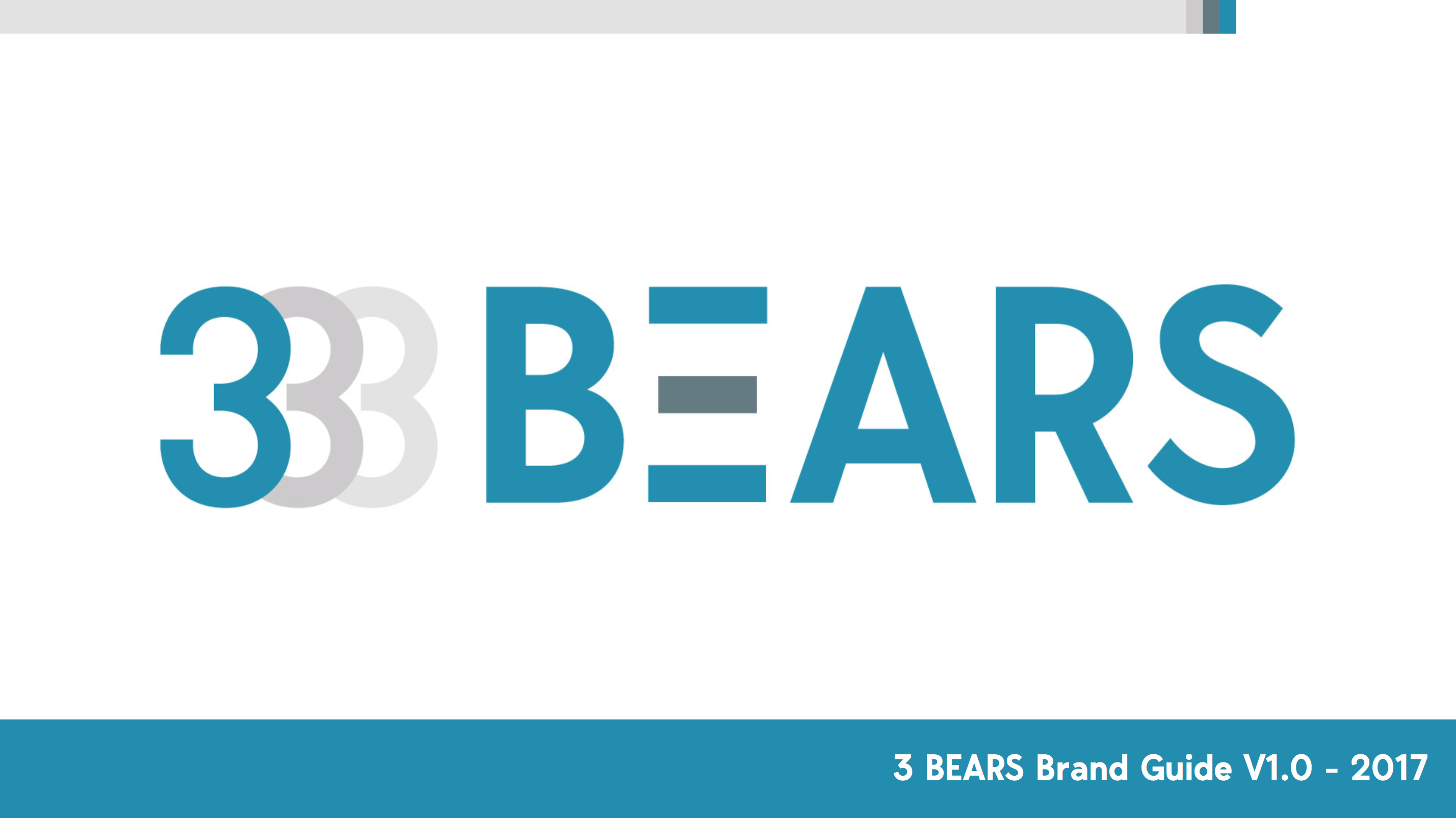
3 Bears
Brand & Logo Design
Our client at 3bears requested a new logo for their wholesale sales business. They required a clean and minimal design using a simplified color palette. As a new business we had a clean slate to start with and that is always a great place to begin. They wanted something that wasn't typically used in their industry and we opted for the clean minimal style to cut through the noise. In addition to the design we also created a brand guide to align the company brand to 3rd party vendors and to bring brand consistency for all of their marketing materials.

Initial Concepts
Initial concepts started with defining the target audience that is primarily a male dominated industry focused on business owners. There were a couple of directions we worked through. One of the obvious places to start was incorporating Bears into the design. The second was a font treatment playing on the number 3 or some simplified iconography.
Sketches & Line Art
We like to rough in the concept with thumbnail sketches and pencil work for icons and shape elements. The bear theme was a fun exercise in design and styles. We went with aggressive male focused bear designs and softer more minimal graphical treatments of the bear. Here are few examples of the bear sketches.
For the text treatment we still worked out concepts on paper drafting up font styles and layouts for the font and some ripping elements. It's always faster to do this digitally but we find the looseness of the paper allows us to not be so committed to the layouts. These are a few treatments we were working through for the font treatments.
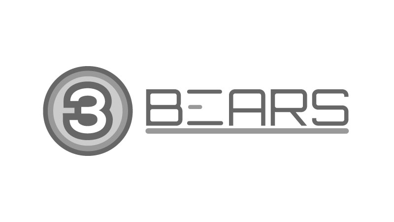
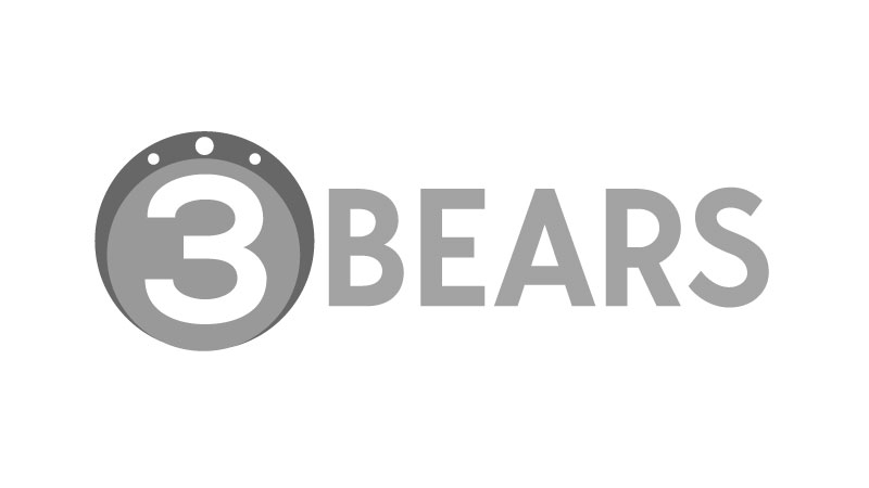
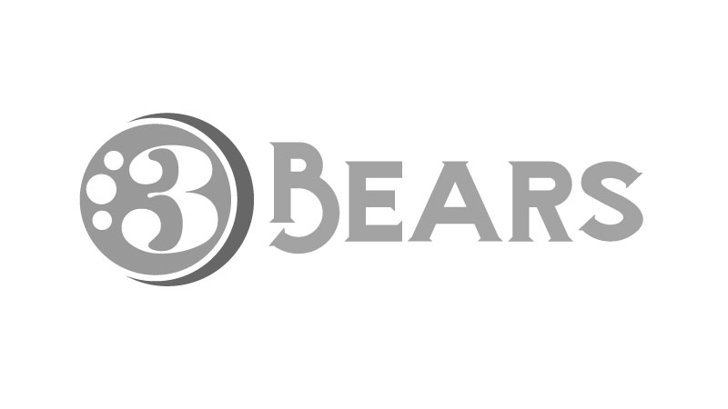
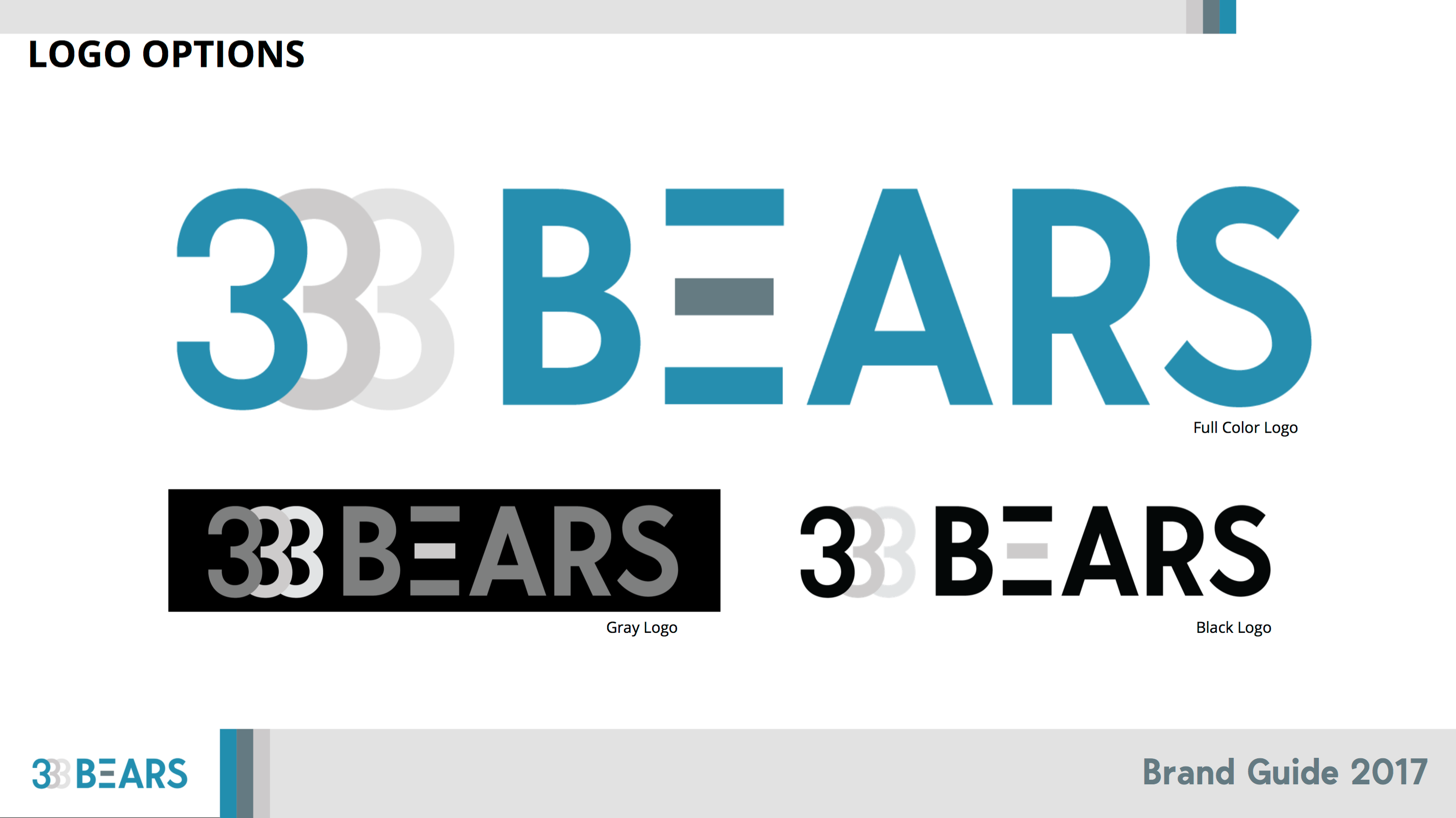
Digital Designs: Black & White
Based on client feedback and some more discovery we landed on the font treatment direction and ditched the bear imagery and ripping elements all together. At this stage we are committed to the computer for the designs. We play with font treatments and balancing the designs throughout this step. We usually work with black and white variations to nail the design and composition. Working from large to small formats to determine scalability.

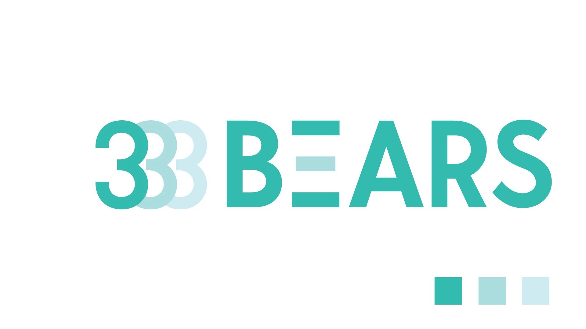
Digital Designs: Color Comps
Once we have landed on the core design layout and font styles we move into the color treatments. We leverage many color theory practices here and align that to the brand guide that we also developed. Below you can see a few variations of the color treatments we worked through.


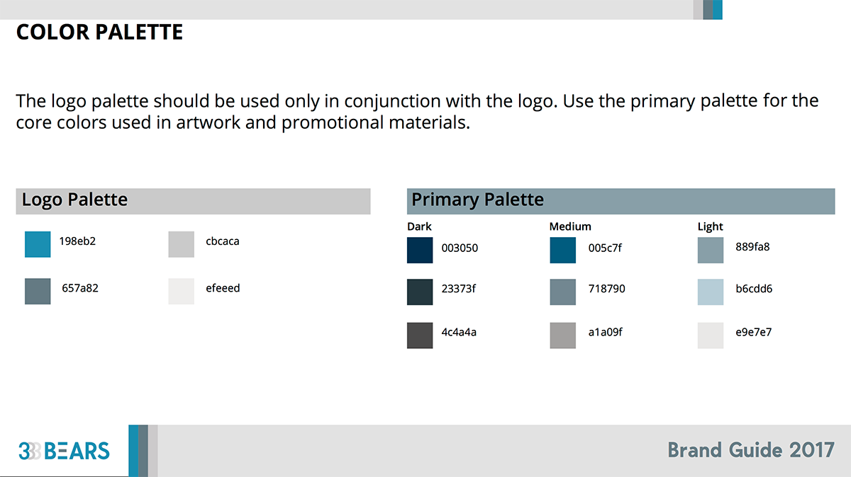
Brand Guide
Your company needs more than just a logo it requires a brand guide to grow. The brand guide serves as a series of guidelines for your organization and vendors to follow. The brand guide should align to your marketing campaigns and all customer facing materials. Having a consistent brand guide is essential. It allows your organization to stay aligned and consistent at all touch points.

Your brand is the personality and tone of your entire business. This has to reflect your values and appeal to not just you, but your audience. We help customers with new ideas and refreshing existing concepts. Applying a modern style to your brand can dramatically increase the trust of your audience. If you have any questions please reach out. We look forward to hearing from you!